 |
| 516ma.com |
Facebook used to have a blogging feature
called Notes, but
it was buried in the interface when Timeline launched in 2011 and left to languish.
In 2012,
Medium was launched by Twitter cofounders Ev Williams and Biz Stone and
gained steam to become
the place for
casual bloggers and journalistic experiments. Compared to Twitter’s
140-character bursts, Medium was a platform for
something meatier. It focused
on simplicity – a ‘what you see is what you get’ publishing tool with no
gratuitous formatting to distract you from your words. A year later there
was the
$1.1 billion blockbuster deal between Yahoo and microblogging platform
Tumblr.
 |
| blog.quiet.ly |
Facebook needed to wake up if it wanted to stay in the blogging
game. The internet was ready to blog, but people didn’t want to set up a whole custom
website to do it. Notes has
long been overlooked, partly because it is buried
in Timeline’s crowded ‘More’ dropdown menu, sandwiched between the bookmarks
for Reviews and Instagram. It was a place where people could post
embarrassing
Q&As about themselves, and not much else. There was no hint of personalisation
except for a few basic formatting tools and photo embedding – no videos or Gifs,
fundamentals on Tumblr. When you published a Note, it went public on the news feed,
but lived in a section buried under a long list of third-party apps. Compare
that to Tumblr, where there’s a rich choice of customisation options and the
ability to embed most kinds of media. Posts are shared with your Tumblr
followers, and, unlike Facebook notes, they
don’t have to compete with other types
of content on the dashboard.
 |
| techcrunch.com |
Now, Facebook is testing a design update to Notes which
answers the call for a much
slicker and simpler blogging tool, adding
full-width images without cluttered sidebars and a bigger text size that sets
it apart from a normal post. It also allows for
big, eye-catching cover images
like the ones on Facebook profiles.
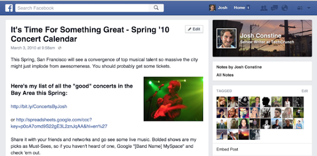
Here’s an example of the old Notes design:
 |
| techcrunch.com |
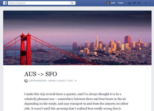
Compare with the new, more professional-looking design (without
the awkward sidebar):
 |
| techcrunch.com |
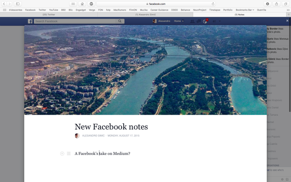
The full-width cover images are similar to those on Medium:
 |
| techcrunch.com |
There’s still no option to embed videos or Gifs, but you can
tag people in your posts. There are no ads, which is an improvement on most
free blogging giants like Wordpress. The question is whether Facebook will put
the
power of the news feed behind Notes. Medium relies on Twitter for
distribution, while Tumblr still has a niche feel due to its fandoms and NSFW
content. People who use Facebook
already have an audience, so they will publish
there. It’s similar to how Facebook used
autoplay clips in the news feed to
invade video sharing. You can share a Facebook Note’s link just like a Medium
link, but you’ll get extra eyes on Facebook
just by using its platform. If Facebook
can make the in-site experience of reading Notes better than clicking out to
read a blog on another blogging site, then it may be one step closer to
taking
over the Internet.
Aaron Waterhouse
Aaron is a recent English graduate from Durham University who is now working as a content writer intern. An enthusiastic traveller, he hopes to become a journalist and report from around the world. Follow him @AaronAtSMF.


 Reviewed by Unknown
on
Monday, August 31, 2015
Rating:
 Reviewed by Unknown
on
Monday, August 31, 2015
Rating:






 Entrepreneur, international speaker on Social Media Marketing. First one in the UK to write and speak in conferences about Twitter as a marketing tool. Consultant to Corporate Companies, Government Organizations, Marketing Managers and Business Owners.
 Aspiring novelist with a passion for fantasy and crime thrillers. He hopes to one day drop that 'aspiring' prefix. He started as a writer and soon after he was made Executive Editor and Manager of the team at Social Songbird. A position he held for 5 years.
 Musician, audio technician, professional tutor and a Cambridge university English student. Interested in writing, politics and obsessed with reading.
 Recently graduated with a BA in English Literature from the University of Exeter, and he is about to study an MA in Journalism at the University of Sheffield. He is an aspiring journalist and novelist; in his free time he enjoys playing chess, listening to music and taking long walks through nature.
 Lucy is an undergraduate BSc Politics and International Relations student at the London School of Economics and Political Science.
 Anna Coopey is a 4th year UG student in Classics at the University of St Andrews in Scotland. She is a keen writer and researcher on a number of topics, varying from Modern Greek literature to revolutionary theory.
